Twenty Twenty-Four is the new, stylish and versatile, default theme for WordPress Version 6.4.
A block theme designed to take full advantage of full site editing capabilities, particularly the opportunities offered by patterns. Create new pages in a matter of moments by constructing them from the wide range of patterns that come bundled with the theme.
Quick specs
- Requires at least WordPress 6.4.
- Requires at least PHP version 5.6.
Full site editing support
Twenty Twenty-Four is designed to support full site editing’s powerful features, including:
- Site Editor: an editor that allows you to edit all parts of your site, navigate between templates, and more.
- Styles: a feature that allows you to customize your site, including individual blocks, as much as you’d like with different colors, typography, layouts, and more.
- Templates: edit, create, and manage templates used by pages, posts, and other content.
- Template parts: a way to organize and display groups of blocks as part of a block template mainly for site structure, like Headers and Footers.
- Theme blocks including the Navigation block, Query Loop block, and more.
Like its predecessor Twenty Twenty-Three, this theme is designed to use WordPress site-editing features instead of theCustomizer, which will be hidden by default. The Customizer may be automatically reactivated if you have plugins that require it.
One theme, many variations
In the past, default themes often centered around a specific topic or style. However, Twenty Twenty-Four breaks away from this tradition. This theme is thoughtfully designed to be your all-encompassing choice for any type of website, regardless of its specific focus.

The Twenty Twenty-Four theme allows users to change certain Templates to use alternative patterns designed for specific use-cases: Business (the default), Writer, and Portfolio.
Alternative patterns
Alternative patterns for the Writer and Portfolio types can be switched to for the following templates:
- Blog Home
- Index
- Archive
- Search
You can use the Replace Template functionality to select one of the alternative patterns for your current template.
- When editing one of the Templates mentioned above – make sure the ‘Template’ tab of the sidebar inspector is selected.
- Click the three dots next to the Template name, and select the ‘Replace Template’ option from the menu that appears.
- You will be shown a selection of alternative patterns to choose from. Clicking to select one will replace the existing template contents with the new pattern.
- Save the changes to your template.
Template Parts
Twenty Twenty-Four also includes a range of different layouts for the Header and Footer of your site. When editing your Templates you can replace the template part with one of the variants.
Custom Templates
Twenty Twenty-Four includes several custom page templates for you to use:
- Page no Title: the layout of a standard page, but with no page title at the top.
- Page with Sidebar: displays page content with a sidebar on the right hand side.
- Page with Wide Image: displays a wide featured-image with page title on the left, and content on the right.
Block patterns
Explore patterns to save time while crafting creative layouts. Patterns are collections of predesigned blocks whose text and media content can be quickly replaced by your own. Whether a call-to-action, an event announcement, or FAQ, patterns can help jump-start the creation of your page or post.

Style variations
Twenty Twenty-Four’s comes with a minimalist, but versatile, palette in monochromatic greys.

Prefer a different look? Visit the Styles area in the Editor and choose from 9 additional style variations to instantly switch up the design, including colors and typography.

Block variations
Twenty Twenty-Four comes with style variations for a number of blocks – allowing slightly different appearance from their defaults.
Heading block
Headings in Twenty Twenty-Four come with a variation that includes an Asterix as a bullet point above the heading.
When editing your headings – you will see an option in the sidebar to switch to the variant style. Selecting the ‘With asterisk’ style will keep the size and font of your heading – but add the stylized asterix above it.
List block
List items in Twenty Twenty Four come with a variation that uses a checkmark as bullet points instead of the default style.
When editing your list – you will see an option in the sidebar to switch to the variant style. Selecting the ‘Checkmark’ style will keep the swap the default bullet for a checkmark.
Details block
The Details block in Twenty Twenty Four come with a variation that uses an arrow to mark the summary instead of the default style.
When editing your Details block – you will see an option in the sidebar to switch to the variant style. Selecting the ‘Arrow icon’ style will keep the swap the default marker dor the summary section to use an arrow icon.
Navigation links
Links within Navigation blocks in Twenty Twenty Four come with a variation that adds an arrow to the right of the link text (sometimes used for indicating a link that leaves the main site).
When editing menu items – you will see an option in the sidebar (Style tab) to switch to the variant style. Selecting the ‘With arrow’ style will add the arrow to the right of the link text.
Category and Tag list blocks
Caterogy and Tag list blocks in Twenty Twenty Four come with a variation that styles each term as a ‘pill’ with a light background.
When the Category or Tag blocks within a Query Loop – you will see an option in the sidebar (Style tab) to switch to the variant style. Selecting the ‘Pill’ style will add a light background color (with rounded corners) to each term in the list..
Design specifications
Twenty Twenty-Four comes with the following defaults for style.
- Cardo Font for headlines.
- Sans-serif System font for paragraphs.
- Instrument Sans, Inter, and Jost as alternative fonts.
- The default color palette of Twenty Twenty-Four is light, providing a fresh and inviting appearance. The Style Variations (mentioned above) contain a range of alternative color palettes.
- A content width of 620 pixels and ‘Wide’ widthof 1280 pixels.
Should you wish – you can also view a more complete list of the spacing, color, and layout presets used by the theme. And remember, the Site Editor’s Styles tools give a wide range of options for customizing the style of your site beyond these defaults.
Support and resources
Get community help with Twenty Twenty-Four in its support forum.
Learn how to take full advantage of full site editing with the Simple Site Design with Full Site Editing course on Learn.WordPress.org.
Read more about the Twenty Twenty-Four theme in the introduction post.
WordPress の HTTPS 化入門
HTTPS を実現するためには、サーバーにSSL証明書をインストールする必要があります。
Let’s Encrypt はすべての人に無料の SSL 証明書を提供する非営利団体で、2020 年 2 月の時点で 10 億を超える証明書を発行しました。証明書を取得する最も簡単な方法は、EFF certbot tool を使用することです。そのサイトには、いくつかの異なる Web サーバーとオペレーティング システムの証明書をインストールおよび更新するための完全な手順が記載されています。
ローカル開発の場合、OpenSSL を使用して自己署名証明書を作成できますが、生成された証明書は他の人から信頼されないため、使用は限定されており、プライベート サーバーにのみ使用する必要があります。
HTTPS の Web サーバー レベルでは、WordPress に特に必要な追加または特別な設定はありません。 Web サーバーが適切に設定されていれば、WordPress はデフォルトで HTTPS の URL を使用できるようになります。
HTTP URL のデフォルトポートは 80番、HTTPS のデフォルトポートは 443番 です。これらのポートは、ネットワーク・ファイアウォールを介して開かないようにしてください。 Apache には mod_ssl モジュールが含まれており、これを有効にして適切に設定する必要があります。Certbot を使用している場合は、必要な VirtualHost 設定を自動的に設定し、作成できます。
WordPressにHTTPSを導入する
WordPress に HTTPS サポートを実装する場合は、WordPress アドレスとサイトアドレスの URL を httpsに設定するだけです。 WordPress をインストールするには、HTTP または HTTPS のいずれかを使用して開始できます。どちらも機能し、後で切り替えることもできます。
[設定] > [一般] に移動し、WordPress アドレス (URL) とサイト アドレス (URL) が https であることを確認します。そうでない場合は、http の後に「s」を追加し、https にして保存します。

サイトヘルス ([ツール] > [サイトヘルス]) は、Web サイトが HTTPS を使用していないことを通知します。

バージョン5.7以降、SSL証明書がすでにサーバーに設定されている場合、WordPress は自動的に HTTPSに切り替えることもできます。

WordPressのHTTPS化ベストプラクティス
すべての本番WordPressサイトでは、HTTPS を使用することをおすすめします。
- 信頼できる Web ホストを利用する。ほとんどの Web ホストでは HTTPS サービスを標準で提供している。
- Let’s Encrypt の SSL 証明書を利用する。無料で使いやすい。
- SSL 対応 CDN から静的コンテンツを配信する。
HTTP トラフィックを HTTPS サイトにリダイレクトする必要があるかもしれません。 Apache の場合は、例えば VirtualHost エントリを2つ作成することで可能です:
<VirtualHost *:80>
    ServerName mkaz.blog
    Redirect / https://mkaz.blog/
</VirtualHost>

<VirtualHost *:443>
    ServerName mkaz.blog
    DocumentRoot /home/mkaz/sites/mkaz.blog
    <Directory /home/mkaz/sites/mkaz.blog>
        Options Indexes FollowSymLinks
        AllowOverride All
        Require all granted
    </Directory>

    SSLEngine on
    SSLCertificateFile    /etc/letsencrypt/live/mkaz.blog/cert.pem
    SSLCertificateKeyFile /etc/letsencrypt/live/mkaz.blog/privkey.pem
    SSLCertificateChainFile /etc/letsencrypt/live/mkaz.blog/fullchain.pem
    IncludeOptional /etc/letsencrypt/options-ssl-apache.conf
</VirtualHost>
WordPressのHTTPS化のバッドプラクティス
- HTTPS と HTTP URL の両方からサイトを提供する場合は、HTTPS を使用してリダイレクトする。
- HTTPS ページで、HTTP から提供される CSS、JS、画像などの混合コンテンツを使用する。
参考文献と役立つリンク
- Why should I use HTTPS
- Let’s Encrypt and Certbot
- Apache Module mod_ssl – Apache モジュールの公式ドキュメント
- Encrypting the Web (EFF.org)
- HTTPS as a ranking signal (Google)
- Best Practices Securing Your Site (Google)
Twenty Twenty-Three is the new, accessibility-ready, default theme for WordPress Version 6.1.

A minimalist block theme designed to take full advantage of full site editing capabilities, Twenty Twenty-Three includes a collection of ten community-submitted style variations. Explore the Styles panel and change the look-and-feel of your site in an instant – bold and bright, or soft and subtle, the choice is yours.
Quick specs
- Requires at least WordPress 6.1.
- Requires at least PHP version 5.6.
Full site editing support
Twenty Twenty-Three is designed to support full site editing’s powerful features, including:
- Site Editor: an editor that allows you to edit all parts of your site, navigate between templates, and more.
- Styles: a feature that allows you to customize your site, including individual blocks, as much as you’d like with different colors, typography, layouts, and more.
- Templates: edit, create, and manage templates used by pages, posts, and other content.
- Template parts: a way to organize and display groups of blocks as part of a block template mainly for site structure, like Headers and Footers.
- Theme blocks including the Navigation block, Query Loop block, and more.
Like its predecessor Twenty Twenty-Two, this theme is designed to use WordPress site-editing features instead of the Customizer, which will be hidden by default. The Customizer may be automatically reactivated if you have plugins that require it.
Templates
Twenty Twenty-Three includes several custom templates for you to use:
- Blank: this displays post content without any additional blocks.
- Blog (Alternative): provides a different way of displaying blog posts, in a list format with the date on the left and the post title on the right.
Block patterns
Explore patterns to save time while crafting creative layouts. Patterns are collections of predesigned blocks whose text and media content can be quickly swapped out with your own. Whether a call-to-action, an event announcement, or a pricing table, patterns can help jump-start the creation of your page or post.


Style variations
Twenty Twenty-Three’s default colour scheme consists of a minimalist black-and-white palette, along with green accents.

Prefer a different look? Visit the Styles area in the Editor and choose from ten additional style variations to instantly switch up the design, including colors and typography.


by @richtabor

by @beafialho

by @luminuu

by @beafialho

by @critterverse

by @nudge

by @amjadr360

by @anariel-design

by @colorful-tones

by @bgardner
Design specifications
Twenty Twenty-Three takes advantage of fluid typography presets, so that each piece of text can adapt to any screen size, automatically. The theme also uses fluid spacing presets, to help maintain consistency in the spacing between blocks at all screen sizes. If you’re interested in learning more about the sizes, spacing, and font families in those presets, check out Twenty Twenty-Three’s design specification.
Support and resources
Get community help with Twenty Twenty-Three in its support forum.
Learn how to take full advantage of full site editing with the Simple Site Design with Full Site Editing Learn WordPress course.
Read more about the Twenty Twenty-Three theme in the introduction post.
Twenty Twenty-Two is the new default theme for WordPress Version 5.9.

Everyone deserves a truly unique website, built on a solid, well-designed foundation. Twenty Twenty-Two aims to help you achieve that by offering a wide set of patterns, templates, headers, footers, and custom color palettes. As the first-ever default block theme, Twenty Twenty-Two invites you to explore full site editing and create a site that reflects your individual vision.
Quick Specs
- Requires at least WordPress 5.9.
- Requires at least PHP version 5.6.
Full Site Editing Support
Twenty Twenty-Two is designed to support all of the features of full site editing. This includes the following:
- Site Editor: an editor that allows you to edit all parts of your site, navigate between templates, and more.
- Styles: a feature that allows you to customize your site, including individual blocks, as much as you’d like with different colors, typography, layouts, and more.
- Templates: edit, create, and manage templates that a page or posts uses.
- Template parts: a way to organize and display groups of blocks as part of a block template mainly for site structure, like Headers and Footers.
- Theme blocks including the Navigation Block, Query Loop block, and more.
Thanks to these options you should find that you won’t need to switch themes as often to create the desired look and feel of your site.
Keep in mind that Twenty Twenty-Two is designed to use the above features instead of the Customizer to edit your site. The Customizer will be hidden by default, though it may be reactivated if you have plugins installed that require it.
Templates
Twenty Twenty-Two has three custom templates for you to use with your posts and pages:
- Blank: this includes the post content without any additional blocks.
- Page (Large Header): this includes a big, visually interesting headline.
- Single Post (No Separators), and Single Page (No Separators): These are the standard post/page templates, but with no horizontal separators on them.
When exploring these templates and making them your own, be sure to take advantage of the Page patterns that you can use to build your templates. To learn more about templates and how to use them on your site, please read the Template Editor support article.
Block Patterns
Twenty Twenty-Two comes with 64 patterns to create beautiful content from footers, headers, pages, and more. To learn more about block patterns and how to use them on your site, please read the Block Patterns support article.
Here are just a few examples to look forward to:
Subscribe callout

Layered images with duotone

List of events

Color Palette
The theme provides several recommended colors that work well with the design of the theme. You can use these colors throughout your site including when customizing your site with the Styles feature or when customizing individual blocks. Duotone filters are also included as part of the color palette options so you can easily have all aspects of your site embrace a shared palette:
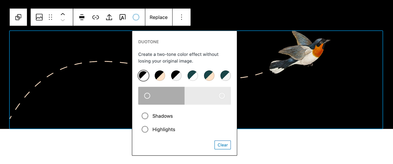
Black
White
Dark Green
Beige
Light Grey
Support and Resources
Get community help with Twenty Twenty-Two in its support forum.
Learn how to take full advantage of full site editing with the Simple Site Design with Full Site Editing Learn WordPress course.
Read more about the Twenty Twenty-Two theme in the introduction post.

Twenty Twenty-One はあなたのアイデアのための真っ白なキャンバスで、ブロックエディターはそこにあなたのイメージをどのようにも描ける最高のブラシになります。新しいブロックパターンを使えば、美しいレイアウトを瞬時に作成できます。このテーマの柔らかな色合いと、目を引く — しかも時代を超えた — デザインは、あなたの描く作品を輝かせてくれるでしょう。ぜひ試してみてください。あなたのポートフォリオ、ビジネスサイト、個人ブログが Twenty Twenty-One でどのように生まれ変わるのかを、ぜひご覧ください。
仕様の概要
- WordPress 5.3以降のバージョンで動作します。
- PHP のバージョンは最低限5.6が必要です。
- 1440pxのラップトップ画面では、メインカラムの最大幅は1240pxです。 「ワイド」ブロック幅でも同様に最大1240pxで、「フル」ブロック幅では画面の幅全体に広がります。
- アイキャッチ画像のサイズは、幅が610px以上が推奨されます。
- ロゴ画像は幅300px以上、高さ100px以上が推奨されます。
- Twenty Twenty-One には、サイトコンテンツの下とフッターの上に表示されるウィジェットエリアがそれぞれ1つずつあります。各ウィジェットは、利用可能なスペースの3分の1を使って、最大380pxの幅となります。
- Twenty Twenty-One は Internet Explorer 11 での表示に制限があります。
アクセシビリティの機能
- コンテンツのリンクへの移動
- ランドマークを使ったセマンティックな HTML
- ハイコントラストモードとダークモードに対応
- キーボードナビゲーションに対応
スターターコンテンツ
Twenty Twenty-One には、テーマのブロックパターンやスタイルの使い方を説明するスターターコンテンツが付属しています。スターターコンテンツを有効化できるのは、デフォルト以外のページや投稿がないインストールしたてのサイトのみです。有効化するには、カスタマイザーに移動して「保存して公開」ボタンをクリックしてください。
Full Block Editor Support
Twenty Twenty-One is designed and developed to take full advantage of the creative freedom enabled by the block editor. Extra care has been given to the Columns block so you can create impressive landing pages with intricate blocks layouts. Twenty Twenty-One includes styles for the block editor, so what you see in the editor will almost exactly match the end result.
Block patterns
Large text

Links area

Contact Information

Media & Text article title

Overlapping images

Two Images

Overlapping images and text

Portfolio list

Learn more about block patterns and how to add them
Block styles
Block styles are selected in the block Settings sidebar in the editor.
Social links: In addition to the default styles, you can choose a dark grey icon color.
Separator: In addition to the default styles, you can choose an extra thick separator.
Borders
In Twenty Twenty-One, borders can be added to the following blocks:
- Media & Text
- Latest posts -Styles for borders and dividers
- Image -Styles for borders and frames
- Cover
- Group
Overlapping columns
The columns block has an optional style called overlap, where the content of every second column overlaps the previous:

Color palette
The theme provides several recommended colors that works well with the design of the theme. Select the colors in the background color setting and in the editor. There are also matching gradients.
Black
White
Dark Grey
Grey
Green
Blue
Purple
Red
Orange
Yellow
Custom Background Color
Twenty Twenty includes the option to change your site’s background color.
To change the background color, navigate to Customizer → Colors & Dark Mode.

Add your own custom color, or select a color from the palette.

The colors of the elements on your site are automatically calculated based on the background colors you pick. This ensures that the color contrast is always high enough to be accessible to all visitors.
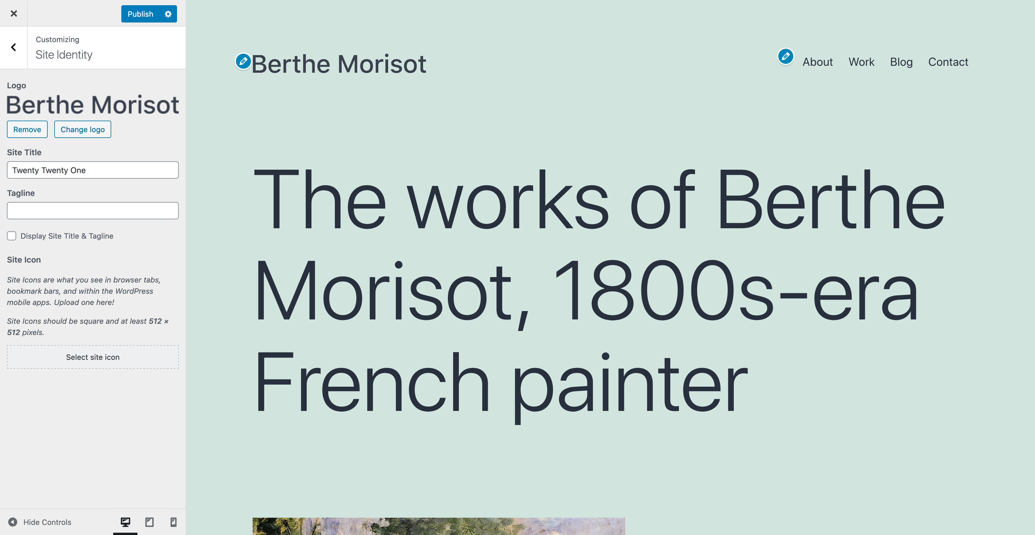
Site Logo
Twenty Twenty-One includes a site logo setting which can be used to display the logo of your business or an image of yourself. You can set your site logo by going to Customizer → Site Identity.
The recommended size of the logo is at least 300px wide, or at least 100px tall. The logo is visible in the header and footer.
The logo in the site header is centered. If you want to hide the Site Title and Tagline, the logo is placed to the left of the menu:
Excerpt settings
In the Customizer you will find a panel called Excerpt Settings:

Here you can choose if the blog and archive pages should show the full content or only the summary.
The default is summary. The search result page always shows the summary.
When the summary is selected, only text will be displayed.
Menus
Twenty Twenty-One includes two menu locations:
- A traditional responsive horizontal menu at the very top of the site, which supports dropdown menus.
- A horizontal menu between the widget area and the footer at the bottom of the screen, which only supports one level of navigation.
You can choose a menu location by going to Appearance → Menus, where you can assign a menu to the “Primary Navigation” or the “Footer Navigation”. You can also use both menu locations in combination, if you prefer.
Menu descriptions
The primary navigation menu supports menu descriptions.

To enable menu descriptions, go to Appearance → Menus, and open the Screen Options tab at the top of the page.
Under Show advanced menu properties, check the box for Description:

Add a description by selecting the menu item and filling out the Description textarea. Remember to save your changes.

Add Social Icons
There are two ways to add social icons in your site:
- Use the Social Icons block within the editor.
- Add a link to a social media site to your footer menu.
When you create a social menu, the text label you provide will be hidden, and an icon will be shown in its place. If you’re not familiar with this functionality, please check out the documentation from Twenty Fifteen.
Twenty Twenty-One provides icons for the following social media services:
- 500px
- Amazon
- Bandcamp
- Behance
- Codepen
- DeviantArt
- Dribbble
- Dropbox
- Etsy
- Feed
- Flickr
- Foursquare
- GitHub
- GitLab
- Goodreads
- Kickstarter
- JSFiddle
- Last.fm
- Mastodon
- Medium
- Meetup
- Skype
- Snapchat
- SoundCloud
- Spotify
- Tumblr
- Twitch
- Vimeo
- VK
- WordPress
- Yelp
- YouTube
Additional icons can be added following the steps under “Adding icons in Twenty Twenty” at Themes field guide: WordPress 5.5.
Widgets
Twenty Twenty-One comes with support for one widget area, at the very bottom of each page. Each widget column is 33% of the site width, up to 380px.

Post formats
Twenty Twenty-One has support for post formats.
Post formats are selected in the editors Settings sidebar → Post → Status & visibility.
- Standard
- Aside
- Gallery
- Link
- Image
- Quote
- Status
- Video
- Audio
- Chat
Language Support
Twenty Twenty-One includes styles for RTL languages.
The theme uses a native system font stack. This font stack provides support for a large number of languages.
-apple-system, BlinkMacSystemFont, "Segoe UI", Roboto, Oxygen-Sans, Ubuntu, Cantarell, "Helvetica Neue", sans-serifExpand this list to see the fonts used for non-Latin languages.
- ar, ary, azb, ckb, fa-IR, haz, ps: Tahoma, Arial, sans-serif.
- zh-CN: PingFang SC, Helvetica Neue, Microsoft YaHei New, STHeiti Light.
- zh-TW: PingFang TC, Helvetica Neue, Microsoft YaHei New, STHeiti Light.
- zh-HK: PingFang HK, Helvetica Neue, Microsoft YaHei New, STHeiti Light.
- bel, bg-BG, kk, mk-MK, mn, ru-RU, sah, sr-RS, tt-RU, uk: Helvetica Neue, Helvetica, Segoe UI, Arial, sans-serif.
- bn-BD, hi-IN, mr, ne-NP: Arial, sans-serif.
- el: Helvetica Neue, Helvetica, Arial, sans-serif.
- gu: Arial, sans-serif.
- he-IL: Arial Hebrew, Arial, sans-serif.
- ja: sans-serif.
- ko-KR: Apple SD Gothic Neo, Malgun Gothit, Nanum Gothic, Dotum, sans-serif.
- th: Sukhumvit Set, Helvetica Neue, Helvetica, Arial, sans-serif.
- vi: Libre Franklin, sans-serif.
Dark Mode Support
One of the accessibility features of the Twenty Twenty-One theme is support for the visitor’s color scheme preferences in their operating system or browser’s settings. The feature is opt-in and supported in most operating systems, including Android, iOS, OSX, Windows 10, as well as most Linux distributions.
If you have Dark Mode enabled, your site will be shown to visitors using a light or dark color scheme, respecting their operating system’s preferences. Depending on their lighting conditions or personal preferences they may choose to switch color schemes using a dedicated button on the bottom-right of their site (or bottom-left for RTL languages).
Enabling Dark Mode from the Customizer
To activate Dark Mode Support, you can go to the Colors & Dark Mode section in your Customizer. If you have a light color selected for the site’s background, you will be able to see and activate the Dark Mode Support setting. The background color you select will be applied to light mode, while Dark Mode colors are optimized automatically. You can use the Dark Mode On/Off button at the bottom of the preview screen to toggle between dark & light schemes in your preview.
Dark Mode in the Editor
The editor will by default respect your operating system’s color scheme settings. If on the front of your site you have chosen a different scheme (using the Dark Mode On/Off button), then the editor will use the preferred scheme.

Block-Based Theme
A version of Twenty Twenty-One is also being built as an experimental block-based theme. You can follow along with development, contribute, and test the theme via GitHub.
Support and Resources
Get community help with Twenty Twenty-One in its support forum.
You can also read the theme’s changelog.
このページは、2022年10月18日以前に作成された WordPress パッケージに含まれていた wp-config-sample.php ファイルの日本語翻訳アーカイブです。詳細はこちらをご覧ください。
ソースファイルはこちらにあります。
<?php
/**
 * WordPress の基本設定
 *
 * このファイルは、インストール時に wp-config.php 作成ウィザードが利用します。
 * ウィザードを介さずにこのファイルを "wp-config.php" という名前でコピーして
 * 直接編集して値を入力してもかまいません。
 *
 * このファイルは、以下の設定を含みます。
 *
 * * データベース設定
 * * 秘密鍵
 * * データベーステーブル接頭辞
 * * ABSPATH
 *
 * @link https://ja.wordpress.org/support/article/editing-wp-config-php/
 *
 * @package WordPress
 */

// 注意:
// Windows の "メモ帳" でこのファイルを編集しないでください !
// 問題なく使えるテキストエディタ
// (http://wpdocs.osdn.jp/%E7%94%A8%E8%AA%9E%E9%9B%86#.E3.83.86.E3.82.AD.E3.82.B9.E3.83.88.E3.82.A8.E3.83.87.E3.82.A3.E3.82.BF 参照)
// を使用し、必ず UTF-8 の BOM なし (UTF-8N) で保存してください。

// ** データベース設定 - この情報はホスティング先から入手してください。 ** //
/** WordPress のためのデータベース名 */
define( 'DB_NAME', 'database_name_here' );

/** データベースのユーザー名 */
define( 'DB_USER', 'username_here' );

/** データベースのパスワード */
define( 'DB_PASSWORD', 'password_here' );

/** データベースのホスト名 */
define( 'DB_HOST', 'localhost' );

/** データベースのテーブルを作成する際のデータベースの文字セット */
define( 'DB_CHARSET', 'utf8' );

/** データベースの照合順序 (ほとんどの場合変更する必要はありません) */
define( 'DB_COLLATE', '' );

/**#@+
 * 認証用ユニークキー
 *
 * それぞれを異なるユニーク (一意) な文字列に変更してください。
 * {@link https://api.wordpress.org/secret-key/1.1/salt/ WordPress.org の秘密鍵サービス} で自動生成することもできます。
 * 後でいつでも変更して、既存のすべての cookie を無効にできます。これにより、すべてのユーザーを強制的に再ログインさせることになります。
 *
 * @since 2.6.0
 */
define( 'AUTH_KEY',         'put your unique phrase here' );
define( 'SECURE_AUTH_KEY',  'put your unique phrase here' );
define( 'LOGGED_IN_KEY',    'put your unique phrase here' );
define( 'NONCE_KEY',        'put your unique phrase here' );
define( 'AUTH_SALT',        'put your unique phrase here' );
define( 'SECURE_AUTH_SALT', 'put your unique phrase here' );
define( 'LOGGED_IN_SALT',   'put your unique phrase here' );
define( 'NONCE_SALT',       'put your unique phrase here' );

/**#@-*/

/**
 * WordPress データベーステーブルの接頭辞
 *
 * それぞれにユニーク (一意) な接頭辞を与えることで一つのデータベースに複数の WordPress を
 * インストールすることができます。半角英数字と下線のみを使用してください。
 */
$table_prefix = 'wp_';

/**
 * 開発者へ: WordPress デバッグモード
 *
 * この値を true にすると、開発中に注意 (notice) を表示します。
 * テーマおよびプラグインの開発者には、その開発環境においてこの WP_DEBUG を使用することを強く推奨します。
 *
 * その他のデバッグに利用できる定数についてはドキュメンテーションをご覧ください。
 *
 * @link https://ja.wordpress.org/support/article/debugging-in-wordpress/
 */
define( 'WP_DEBUG', false );

/* カスタム値は、この行と「編集が必要なのはここまでです」の行の間に追加してください。 */


/* 編集が必要なのはここまでです ! WordPress でのパブリッシングをお楽しみください。 */

/** Absolute path to the WordPress directory. */
if ( ! defined( 'ABSPATH' ) ) {
	define( 'ABSPATH', __DIR__ . '/' );
}

/** Sets up WordPress vars and included files. */
require_once ABSPATH . 'wp-settings.php';
このページは、2022年10月18日以前に作成された WordPress パッケージに含まれていた Readme ファイルの日本語翻訳アーカイブです。詳細はこちらをご覧ください。
ソースファイルはこちらにあります。

セマンティックな個人情報発信プラットフォーム
はじめに
ようこそ。WordPress は私にとってとても特別なプロジェクトです。各開発者や貢献者が独自なものをそこに加え、みんなで一緒に美しいものを作り上げています。私はその一翼を担っていることを誇りに思います。たいへん多くの時間をかけて、WordPress をよりよいものにしようと私たちは日々力を注いでいます。WordPress を選んでいただきありがとうございます。
— Matt Mullenweg
インストール: 5分でインストール
- zip ファイルを空のディレクトリに展開します。そしてすべてのファイルをアップロードしてください。
- wp-admin/install.php をブラウザーで開きます。これによりデータベース接続のための
wp-config.phpの設定を行います。- 何らかの理由でこれがうまくいかなくても、心配しないでください。すべてのウェブホストでうまくいくわけではないのです。テキストエディター (訳注: 日本語版の場合、UTF-8 BOMなし (または UTF-8N) で保存できるエディターを用いてください。Windows の『メモ帳』は用いないでください) で
wp-config-sample.phpを開き、データベースの接続情報を記入してください。 - このファイルの名前を
wp-config.phpとして保存し、アップロードしてください。 - wp-admin/install.php をブラウザーで開いてください。
- 何らかの理由でこれがうまくいかなくても、心配しないでください。すべてのウェブホストでうまくいくわけではないのです。テキストエディター (訳注: 日本語版の場合、UTF-8 BOMなし (または UTF-8N) で保存できるエディターを用いてください。Windows の『メモ帳』は用いないでください) で
- いったん設定ファイルを設置すると、あなたのサイトに必要なデータベースのテーブルが設置されるはずです。もしエラーが発生するようなら
wp-config.phpファイルをもう一度確認し、再度このインストーラーを試してください。それでも失敗する場合は、できるだけ多くのデータを集めてサポートフォーラム (英語) (WP 日本語フォーラム) に行ってください。 - パスワードを入力しなかった場合、パスワードは自動生成されますので、これをメモしてください。ユーザー名を入力しなかった場合、ユーザー名は
adminになります。 - その後、このインストーラはあなたをログインページに案内するはずです。前に選んだユーザー名とパスワードでログインしてください。自動生成のパスワードを使った場合、管理画面の「プロフィール」をクリックしてパスワードを変更することができます。
更新
自動更新機能の利用
- wp-admin/update-core.php をブラウザーで開き、指示に従います。
- もっと何かしたかったですか ? これだけです !
手動更新
- 更新前に、
index.phpなど変更した可能性のあるすべてのファイルのバックアップコピーを必ずとってください。 - 変更したファイルを保存し、古い WordPress のファイルを削除します。
- 新しいファイルをアップロードします。
- ブラウザーで /wp-admin/upgrade.php にアクセスします。
他のシステムからの移行
WordPress は 多くのブログシステムからインポート (英語) (日本語)することができます。まずは上記のように WordPress をインストールして動作させてください。その後に、インポートツールを使ってください。
動作環境
推奨環境
- PHP バージョン 7.4 以上
- MySQL バージョン 5.7 以上、または MariaDB バージョン 10.3 以上
- Apache の mod_rewrite モジュール
- HTTPS のサポート。
- あなたのサイトに wordpress.org へのリンクを。
オンラインの資料
もしこの文書にあなたの疑問への答えが見つからなかったら、ぜひ WordPress の豊富なオンライン資料を利用してください。The WordPress Codex (英語) (WordPress Codex 日本語版) Codex は WordPress のすべてについての百科事典です。WordPress に関する最も総合的な情報源です。 開発ブログ (英語) (日本語訳) ここでは WordPress に関する最新のアップデートやニュースを知ることができます。最新の WordPress 開発ニュースは、デフォルトで管理ダッシュボードに表示されます。 WordPress Planet (英語) WordPress Planet はウェブ中の WordPress からの投稿を集めたニュースアグリゲーターです。 WordPress サポートフォーラム (英語) (WP 日本語フォーラム) 隅々まで探しまわってもなお答が見つからない場合、とても活発で大きなコミュニティを持つサポートフォーラムが役に立つでしょう。助けてもらうコツは、分かりやすいスレッドタイトルをつけて、質問の内容をなるべく詳しく書くようにすることです。 WordPress IRC (Internet Relay Chat) チャンネル (英語) WordPress を使っている人たちの話し合いに使用されているオンラインのチャットチャンネルがあり、時おりここでサポートに関する話題も扱っています。上記 wiki ページで案内されています。(irc.libera.chat #wordpress)
おわりに
- 提案、アイディア、コメントをお持ちだったり、あるいはバグ (うわっ !) を見つけたら、サポートフォーラム (英語) (WP 日本語フォーラム) に参加してみませんか ?
- WordPress はコードを簡単に拡張するための堅牢なプラグイン API (Application Programming Interface) を備えています。この利用に興味のある開発者は Codex のプラグインドキュメント (英語) (日本語) を参照してください。 ほとんどの場合、コアコードを変更するべきではありません。
分かちあい
WordPress には数百万ドルのマーケティングキャンペーンもなければ有名なスポンサーもいませんが、それよりもっとすばらしいみなさんがいます。もしあなたが WordPress を楽しんでくれているのなら、友達にそれを伝えてください。自分よりまだ WordPress の知識がない人のためにセットアップの手助けをしてください。あるいは、WordPress を見落としているメディアのライターにメールを送ってください。
WordPress は、Michel V がはじめた b2/cafélog を公式に引き継いだブログツールです。作業は WordPress の開発者たちによって続けられています。WordPress に支援をしていただけるのなら、どうか寄付をご検討ください。
ライセンス
WordPress は GPL (GNU General Public License) バージョン 2 またはそれ以降の (あなたの選択する) 任意のバージョンの条件に基づいてリリースされているフリーソフトウェアです。license.txt を参照してください。
WordPress relies heavily on the presentation styles within CSS. With the use of Themes, you have an almost infinite choice of layout options. WordPress Themes make it easy to change your website’s appearance, and open up the field to help you create your own Theme and page layout.
CSS stands for Cascading Style Sheets. It allows you to store style presentation information (like colors and layout) separate from your HTML structure. This allows precision control of your website layout and makes your pages faster and easier to update.
This article briefly describes the use of CSS in WordPress, and lists some references for further information. For information on CSS itself, see Know Your Sources#CSS.
WordPress and CSS
WordPress Themes use a combination of template files, template tags, and CSS files to generate your WordPress site’s look.
Template Files
Template files are the building blocks which come together to create your site. In the WordPress Theme structure, the header, sidebar, content, and footer are all contained within individual files. They join together to create your page. This allows you to customize the building blocks. For example, in the default WordPress Theme, the multi-post view found on the front page, category, archives, and search web pages on your site, the sidebar is present. Click on any post, you will be taken to the single post view and the sidebar will now be gone. You can choose which parts and pieces appear on your page, and customize them individually, allowing for a different header or sidebar to appear on all pages within a specific category. And more. For a more extensive introduction to Templates, see Stepping Into Templates.
Template Tags
Template tags are the bits of code which provide instructions and requests for information stored within the WordPress database. Some of these are highly configurable, allowing you to customize the date, time, lists, and other elements displayed on your website. You can learn more about template tags in Stepping Into Template Tags.
Stylesheet
The CSS file is where it all comes together. On every template file within your site there are HTML elements wrapped around your template tags and content. In the stylesheet within each Theme are rules to control the design and layout of each HTML element. Without these instructions, your page would simply look like a long typed page. With these instructions, you can move the building block structures around, making your header very long and filled with graphics or photographs, or simple and narrow. Your site can “float” in the middle of the viewer’s screen with space on the left and right, or stretch across the screen, filling the whole page. Your sidebar can be on the right or left, or even start midway down the page. How you style your page is up to you. But the instructions for styling are found in the style.css file within each Theme folder.
Custom CSS in WordPress
Starting with WordPress 4.7, you can now add custom CSS to your own theme from the Appearance Customize Screen, without the need for additional plugins or directly editing themes and child themes. Just choose the Additional CSS tab when customizing your current theme to get started!
Any CSS changes you make will appear in the preview, just like other changes made in the customizer, this means you have time to tweak and perfect the look of your site, without actually changing anything until you are happy with it all!
Keep in mind that the CSS changes are tied in with your theme. This means that if you change to a new theme, your custom CSS styles will no longer be active (of course, if you change back to your previous theme, they will once again be there).
Why use Custom CSS?
There are a few reasons why:
- If you modify a theme directly and it is updated, then your modifications may be lost. By using Custom CSS you will ensure that your modifications are preserved.
- Using Custom CSS can speed up development time.
- Custom CSS is loaded after the theme’s original CSS and thus allows overriding specific CSS statements, without having to write an entire CSS set from scratch.
WordPress Generated Classes
Several classes for aligning images and block elements (div, p, table etc.) were introduced in WordPress 2.5: aligncenter, alignleft and alignright. In addition the class alignnone is added to images that are not aligned, so they can be styled differently if needed.
The same classes are used to align images that have a caption (as of WordPress 2.6). Three additional CSS classes are needed for the captions, and one more for accessibility. Together, the classes are:
/* WordPress Core
-------------------------------------------------------------- */
.alignnone {
    margin: 5px 20px 20px 0;
}

.aligncenter,
div.aligncenter {
    display: block;
    margin: 5px auto 5px auto;
}

.alignright {
    float:right;
    margin: 5px 0 20px 20px;
}

.alignleft {
    float: left;
    margin: 5px 20px 20px 0;
}

a img.alignright {
    float: right;
    margin: 5px 0 20px 20px;
}

a img.alignnone {
    margin: 5px 20px 20px 0;
}

a img.alignleft {
    float: left;
    margin: 5px 20px 20px 0;
}

a img.aligncenter {
    display: block;
    margin-left: auto;
    margin-right: auto;
}

.wp-caption {
    background: #fff;
    border: 1px solid #f0f0f0;
    max-width: 96%; /* Image does not overflow the content area */
    padding: 5px 3px 10px;
    text-align: center;
}

.wp-caption.alignnone {
    margin: 5px 20px 20px 0;
}

.wp-caption.alignleft {
    margin: 5px 20px 20px 0;
}

.wp-caption.alignright {
    margin: 5px 0 20px 20px;
}

.wp-caption img {
    border: 0 none;
    height: auto;
    margin: 0;
    max-width: 98.5%;
    padding: 0;
    width: auto;
}

.wp-caption p.wp-caption-text {
    font-size: 11px;
    line-height: 17px;
    margin: 0;
    padding: 0 4px 5px;
}

/* Text meant only for screen readers. */
.screen-reader-text {
	border: 0;
	clip: rect(1px, 1px, 1px, 1px);
	clip-path: inset(50%);
	height: 1px;
	margin: -1px;
	overflow: hidden;
	padding: 0;
	position: absolute !important;
	width: 1px;
	word-wrap: normal !important; /* Many screen reader and browser combinations announce broken words as they would appear visually. */
}

.screen-reader-text:focus {
	background-color: #eee;
	clip: auto !important;
	clip-path: none;
	color: #444;
	display: block;
	font-size: 1em;
	height: auto;
	left: 5px;
	line-height: normal;
	padding: 15px 23px 14px;
	text-decoration: none;
	top: 5px;
	width: auto;
	z-index: 100000;
	/* Above WP toolbar. */
}
Each Theme should have these or similar styles in its style.css file to be able to display images and captions properly. The exact HTML elements and class and ID values will depend on the structure of the Theme you are using.
Templates and CSS
To help you understand more about how CSS works in relationship to your web page, you may wish to read some of the articles cited in these lists:
- Using Themes – There are also many advanced articles in this list.
- Templates – Comprehensive list of WordPress Theme and Template articles.
- Theme Development – WordPress Theme Development guide and code standards.
WordPress Layout Help
If you are having some problems or questions about your WordPress Theme or layout, begin by checking the website of the Theme author to see if there is an upgrade or whether there are answers to your questions. Here are some other resources:
- Lessons on Designing Your WordPress Site
- Site Design and Layout – Comprehensive list of resources related to site design in WordPress.
- FAQ Layout and Design
CSS Resources
- Finding Your CSS Styles
- CSS Troubleshooting
- CSS Fixing Browser Bugs
- CSS Coding Standards
- CSS Shorthand
- Know Your Sources#CSS
- Conditional Comment CSS
- Validating a Website
ナビゲーションブロックは、WordPress 5.9で追加された高度なブロックで、サイトのナビゲーションメニューを構造とデザインの両面から編集できます。ナビゲーションブロックは、ブロックテーマやテンプレート編集に対応したテーマで使用できます。
ナビゲーションブロックを追加するには、「ブロックを追加」ボタンをクリックし、ナビゲーションブロックを選択します。また、新しい段落ブロックに「/navigation」と入力して Enter キーを押しても、すぐに追加できます。
ブロックを追加する詳細な方法についてはこちらをご覧ください。
ブロックの構成
ナビゲーションブロックにリンクを追加する方法は、大きく分けて3つあります。
- 既存のメニューを選択する。サイトに既に作成されているメニューを選択できます。
- すべての固定ページを追加する。サイト内のすべてのページを追加し、編集や並べ替えできます。
- 空白で作成する。空白のメニューが作成されます。好きななページやリンクを追加できます。

既存のメニューの選択
ナビゲーションブロックで作成したメニューや以前のテーマのメニューがある場合、ナビゲーションブロックの設定で、これらを選択して使用できます。ナビゲーションブロックを追加して、「メニューの選択」を選択すると、作成したすべてのメニューが表示されます。クラシックテーマのメニューも含め、選択して使用できます。

すべてのページを追加する
このオプションを選択すると、サイト上のすべてのページが自動的にナビゲーションブロックに追加され、そこから自由にカスタマイズできます。ページ数によっては、メニュー作成の効率化に役立ちます。新しいページを追加すると、自動的にこのメニューに表示されます。
このオプションを使用する場合、メニュー項目を移動するには、次の操作が必要です。
- ナビゲーションブロックの中で、移動できない、またはブロックを近くに移動できない個別のメニュー項目を選択します。
- ブロックツールバーの「編集」をクリックします。
- 表示されるポップアップで「変換」を選択します。メニュー項目がリンクに変換され、移動できるようになります。
- すると、メニュー項目を移動するオプションが表示されます。
以下の動画でその手順を紹介します。
空で始めて、新しいメニューを作製する
ナビゲーションブロックを追加し、「空から始める」を選択します。真っ白なキャンバスから、自由にカスタマイズできます。
ブロックのカスタマイズ
メニュー項目の追加
ナビゲーションブロックにメニュー項目を追加するには、いくつかの方法があります。
- インサーターを開き、追加するブロックを選択します。
- ナビゲーション全体のブロックを選択し、その際に表示される「+」ボタンを選択します。 「+」 アイコンを選択すると、「変換」の下に、リンク以外のブロックも追加できるセクションが表示されます。

なお、現時点でナビゲーションブロックに追加できるブロックは限られています。追加できるブロックは以下のとおりです。
- スペーサー
- カスタムリンク
- 投稿リンク
- ページリンク
- カテゴリーリンク
- タグリンク
- ホームリンク
- ページリスト
- 検索
- ソーシャルアイコン
- サイトロゴ
- サイトタイトル
それぞれ、追加後のカスタマイズのレベルが異なります。これらのオプションのいずれかを追加した後、ナビゲーションブロックにさらにブロックを追加する際に、追加のオプションが表示されます。

サブメニュー項目の追加
サブメニュー項目を追加するには、サブメニュー項目を追加するブロックを選択し、ブロックツールバーで、サブメニューアイコンをクリックします。これで、選択したブロックの下に、自動的にサブメニュー項目が追加されます。

以下の動画で、この機能の動きを紹介します。
ブロックの移動
ナビゲーションブロックに追加したブロックを移動するには、2つの方法があります。これらのツールを使用して、各メニューを自由に並べ替えることができます。
素早く変更するには、ブロックを操作する際に表示されるツールバーの移動ハンドルが最も簡単なオプションでしょう。

より高度で複雑な動きをする場合は、ナビゲーションブロックに組み込まれたリストビューを使用してください。アクセスするには、全体のナビゲーションブロックを選択し、リストビューアイコンを選択します。

以下は、この機能の動作を紹介した動画です。
すべてのメニュー項目や特定のメニュー項目を移動できない場合、まずメニューをリンクに変換する必要があります。これは「すべてのページを追加する」オプションを使用した場合に発生します。リンクに変換する方法については、前述のセクションの説明を参照してください。
リンクとタイトルの変更
ナビゲーションメニューに追加される各ブロックには、リンクとタイトルの2つのパーツがあります。
タイトルを変更するには、ブロックのテキストを直接編集してください。
リンクを編集するには、個々のブロックを選択し、ツールバーのリンクアイコンを選択します。すると、メニューのリンク先とタイトルを編集するオプションが表示されます。以下は、この機能の紹介です。
メニュー項目を他のブロックに変換する
ナビゲーションブロック内の各ブロックは、「変換」メニューで他のブロックに変換できます。このオプションにより、異なるブロックを使ったメニューを簡単に構築できます。

メニューの管理
現在選択されているナビゲーションメニューを削除するには、ブロックの設定サイドバー内の「高度な設定」セクションを展開します。「メニューの削除」ボタンを選択すると、ナビゲーションメニューが削除され、現在のナビゲーションブロックがデフォルトの状態にリセットされます。
メニューの削除や名前の変更をまとめて簡単に行うには、下図のようにツールバーの「メニューの選択」項目をクリックし、「メニューの管理」をクリックしてください。

サイト全体を通じて利用されるメニューを削除、名前変更できる専用の画面に移動します。このセクションからは直接、メニューを編集できません。
テーマを越えてメニューを使用する
メニューはデータベースに保存されるため、ブロックテーマにまたがってメニューを再利用できます。ブロックテーマからクラシックテーマに変更した場合は、ナビゲーションブロックで作成したメニューを再利用できます。
ブロックツールバーオプション
各ブロックには固有のコントロールがあり、エディター内でブロックを操作できます。

ナビゲーションブロックには以下のオプションがあります。
配置の変更
- 左揃え: ブロック全体とコンテンツを左に揃える。
- 中央揃え: ブロック全体とコンテンツを中央に揃える。
- 右揃え: ブロック全体とコンテンツを右に揃える。
- 項目の間隔: メニュー項目の間に自動的にスペースを追加する。

メニューを選択
このオプションで、表示するメニューを変更できます。
リストビューを開く
ナビゲーションブロック全体のブロックのみを移動できる、制限されたリストビューが表示されます。
ブロック設定
すべてのブロックには、ブロックツールバーにあるオプションに加えて、エディターのサイドバーにも特定のオプションがあります。サイドバーが表示されていない場合は、「公開」ボタンの隣にある歯車アイコンをクリックしてください。
レイアウト
このオプションにより、ナビゲーションブロックの全体的な配置を制御できます。以下が含まれます。
- 配置: この設定は、ナビゲーションブロックの項目を左、中央、右に揃えます。また、項目と項目の間にスペースを挿入することもできます。
- 方向: この設定は、ナビゲーションブロックのすべての項目の並びを垂直方向と水平方向で切り替えます。
- 複数行に折り返す: このオプションは、表示スペースが十分でない場合に、ナビゲーションブロックで複数行への折り返しの有無を切り替えます。
表示
現在、このセクションには1つの設定しかなく、異なる画面サイズにわたってナビゲーションブロックの表示内容を制御し、レスポンシブメニューのオプションを指定します。
- オフ: 小さい画面サイズでは、メニューアイコンを表示しません。
- モバイル: 小さな画面でサイトを見るとメニューアイコンが表示され、クリックするとメニュー全体が表示されます。
- 常時: 画面サイズに関係なく、メニューアイコンが表示されます。
デフォルトでは、このオプションは「モバイル」に設定されており、小さな画面サイズでは自動的にメニューアイコンが表示されます。メニューアイコンをクリックすると、メニュー全体が表示されるオーバーレイが表示されます。
色
この設定により、ナビゲーションブロックの外観をさらにカスタマイズできます。以下のオプションが用意されています。
- テキスト: ナビゲーションブロック項目のテキスト色を設定する。
- 背景: ナビゲーションブロック項目の背景色を設定する。
- サブメニューとオーバーレイテキスト: サブメニューのテキスト色と、レスポンシブ表示オプションに組み込まれたオーバーレイの色の両方を設定します。
- サブメニューとオーバーレイ背景: サブメニューの背景色と、レスポンシブ表示オプションに組み込まれたオーバーレイの色の両方を設定します。
タイポグラフィ
ナビゲーションブロックのアイテムのタイポグラフィをカスタマイズできます。このブロックは現在、以下のオプションをサポートします。
- フォントファミリー
- 外観
- 行の高さ
- 装飾
- 大文字小文字
- フォントサイズ
このセクションにある「+」ボタンをクリックすると、必要なすべてのオプションにアクセスできます。

寸法
現在、ナビゲーションブロックはブロックの間隔に対応しており、各ブロックの間にカスタム間隔を追加できます。これにより、簡単にブロック全体の外観を統一できます。
高度な設定

このセクションでは以下の操作が可能です。
- メニュー名の変更
- メニューの削除
- HTMLアンカーの追加
- CSSクラスを追加して、自由にブロックをスタイリングする
Changelog:
- Created 2022-01-05
テンプレートパーツブロックは、WordPress 5.9から導入された高機能なブロックです。ブロックテーマやテンプレート編集をサポートするテーマで使用できます。テンプレートパーツブロックは、テーマに付属している場合が多く、サイト構造を整理して表示するために使用されます。テンプレートを作成、編集している間のみ使用でき、サイト上で繰り返される領域のブロックを管理できます。たとえば、サイトヘッダーやサイトフッターのような領域の作成に最適です。テンプレートパーツ内のブロックを変更すると、エディターは、そのテンプレートパーツを含むすべてのブロックテンプレートのブロックを更新します。
テンプレートパーツブロックを追加するには、「ブロックを追加」ボタンをクリックし、テンプレートパートブロックを選択します。また、新しい段落ブロックで「/template part」と入力して Enter キーを押して、すぐに追加することもできます。多くの場合、このブロックを検索すると、ヘッダーやフッターなど、テンプレートパーツブロックの種類を選択するオプションも表示されます。ブロックインサーターでヘッダーやフッターを検索してブロックを挿入するか、ショートカットの「/header」「/footer」を使用することもできます。
ブロックを追加する詳細な手順については、こちらを参照してください。
テンプレートパーツの追加
テンプレートエディターやサイトエディターで直接テンプレートを編集する際に、テンプレートを追加できます。テンプレートパーツを追加した後、既存のパーツから選択するか、新規にテンプレートパーツを作成できます。

既存のテンプレートパーツからの選択
「既存の選択」ボタンを選択すると、既存のパーツを検索、プレビュー、選択できるモーダルウィンドウが表示されます。これらのパーツは、使用するテーマに依存します。

新規テンプレートパーツの作成
「新規テンプレートパーツ」を選択して、名前を付けます。将来、見つけやすいように、説明的な名前を付けるとよいでしょう。

「作成」ボタンをクリックすると、ブロックが配置され、カスタマイズを始められます。
テンプレートパーツリストからの新規テンプレートパーツの作成
ブロックテーマを使用している場合は、管理画面の「外観」 > 「エディター (ベータ)」 > 「テンプレートパーツ」のテンプレートパーツ一覧からも新規に作成できます。「新規追加」ボタンを選択するとモーダルウィンドウが表示され、テンプレートパーツの名前を追加し、領域を選択できます。新規にテンプレートパーツを作成するには、名前を付ける必要があります。

テンプレートパーツのカスタマイズ
テンプレートパーツブロックを追加または選択した後、中にブロックを追加することで、さまざまなカスタマイズが可能です。編集中の現在のテンプレートパーツを見つけやすくするために、以下のオプションの使用をお勧めします。
- テンプレートを編集中にリストビューを使用する。編集するコンテンツ内でヘッダーやフッターをすばやく特定できます。
- 後述するテンプレートパーツフォーカスモードを使用する。
テンプレートパーツフォーカスモード
ヘッダーやフッターなどのテンプレートパーツの編集に集中するために、個々のテンプレートパーツのみを表示する専用モードを使用できます。このモードにアクセスするには、いくつかの方法があります。
- サイトエディターでテンプレートパーツを選択し、縦の三点リーダーメニューをクリックし、「ヘッダーを編集」または各テンプレートパーツ名を選択する。
- リストビューでテンプレートパーツを選択し、縦の三点リーダーメニューをクリックし、「ヘッダーを編集」または各テンプレートパーツ名を選択する。
- ブラウジングサイドバーから、テンプレートパーツに移動し、カスタマイズするテンプレートパーツを選択する。
- トップツールバーから、カスタマイズするテンプレートパーツの横にある「領域」の縦の三点リーダーメニューをクリックする。
このモードへのアクセス方法の一つを動画でご紹介します。
テンプレートパーツの置換
テーマが同じ領域に対して複数のテンプレートパーツを用意している場合、ブロックツールバーの「置換」オプションを使用して、現在のテンプレートパーツを別のテンプレートパーツに置き換えられます。このオプションが表示されない場合は、テーマが同じ領域に対して複数のテンプレートパーツを提供していません。

高度な設定
「高度な設定」では、テンプレートパーツ名を変更したり、領域を一般、ヘッダー、フッターから選択できます。このパネルでは、HTML要素を変更したり、ブロックに CSS クラスを追加できます。以下のHTML要素から選択できます。div、header、footer、main、section、article、aside。

Changelog:
- Created 2022-01-05