Blocks are the Interface
Topics
At the core of Gutenberg lies the concept of the block. From a technical point of view, blocks both raise the level of abstraction from a single document to a collection of meaningful elements, and they replace ambiguity—inherent in HTML—with explicit structure.
From a user perspective, blocks allow any kind of content, media, or functionality to be directly added to their site in a more consistent and usable way. The “add block” button gives the user access to an entire library of options all in one place, rather than having to hunt through menus or know shortcodes.
But most importantly, Gutenberg is built on the principle of direct manipulation, which means that the primary options for how an element is displayed are controlled in the context of the block itself. This is a big shift from the traditional WordPress model, where options that were often buried deep in layers of navigation menus controlled the elements on a page through indirect mechanisms.
So, for example, a user can add an image, write its caption, change its width and layout, add a link around it, all from within the block interface in the canvas. The same principle should apply to more complex blocks, like a “navigation menu”, with the user being able to add, edit, move, and finalize the full presentation of their navigation.
- Users only need to learn one interface — the block — to add and edit everything on their site. Users shouldn’t have to write shortcodes, custom HTML, or understand hidden mechanisms to embed content.
- Gutenberg makes core features more discoverable, reducing hard-to-find “Mystery meat.” WordPress supports a large number of blocks and 30+ embeds. Let’s increase their visibility.
Building Blocks
What does this mean for designers and developers? The block structure plus the principle of direct manipulation mean thinking differently about how to design and develop WordPress components. Let’s take another look at the architecture of a block:
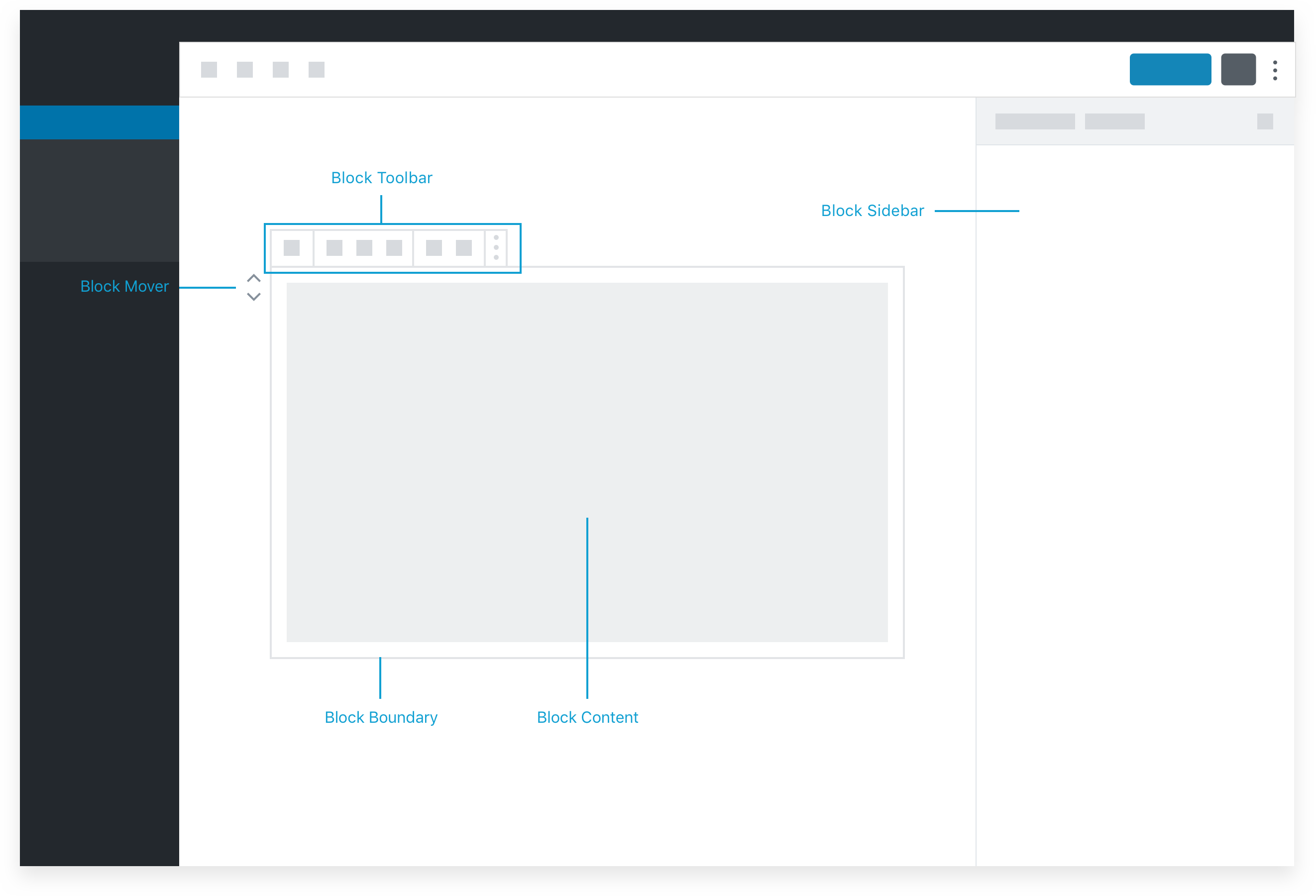
The primary interface for a block is the content area of the block.
The placeholder content in the content area of the block can be thought of as a guide or interface for users to follow a set of instructions or “fill in the blanks” (more on placeholders later). Since the content area represents what will actually appear on the site, interaction here hews closest to the principle of direct manipulation and will be most intuitive to the user. This should be thought of as the primary interface for adding and manipulating content and adjusting how it is displayed.
The block toolbar is the place for critical options that can’t be incorporated into placeholder UI.
Basic block settings won’t always make sense in the context of the placeholder / content UI. As a secondary option, options that are critical to the functionality of a block can live in the block toolbar. The block toolbar is one step removed from direct manipulation, but is still highly contextual and visible on all screen sizes, so it is a great secondary option.
The Settings Sidebar should only be used for advanced, tertiary controls.
The Settings Sidebar is not visible by default on a small / mobile screen, and may also be collapsed even in a desktop view. Therefore, it should not be relied on for anything that is necessary for the basic operation of the block. Pick good defaults, make important actions available in the block toolbar, and think of the sidebar as something that only power users may discover.
最終更新日: