

説明
このプラグインは、ブロックエディターのカラム、横並び、縦積み、メディアとテキストブロックに「モバイルで順序を逆にする」オプションを追加します。
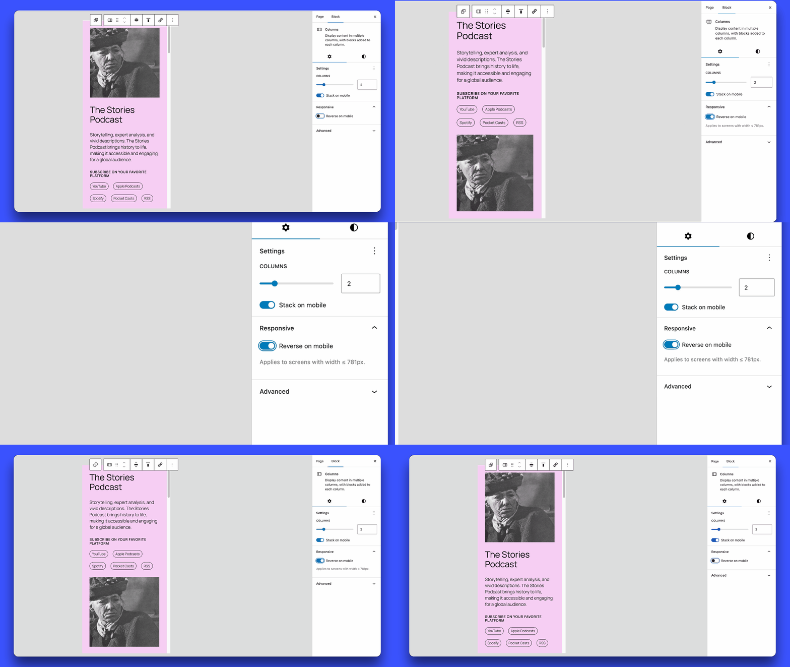
よくあるレイアウトの悩み: デスクトップでは左にテキスト右に画像を配置した2カラム構成にしているものの、モバイルでは縦に並ぶことで画像がテキストの下に表示されてしまうことがあります。このプラグインを使えばデスクトップのレイアウトはそのままに、モバイルでの縦並びの順序を逆にし画像を先に表示させることができます。
ブロック設定で「モバイルで順序を逆にする」を有効化するだけで、モバイル画面で要素の順序が自動的に調整されます。
このプラグインがお役に立ちましたら、ぜひ コーヒーをごちそうしてくださる☕ か、★★★★★のレビューを投稿 していただけるとうれしいです。大きな励みになります !
スクリーンショット
インストール
- プラグインをダウンロード。
- ダウンロードした zip ファイルを解凍します。
block-editor-columns-reverseフォルダーを/wp-content/plugins/ディレクトリにアップロードします。- WordPress の「プラグイン」メニューからプラグインを有効化します。
FAQ
-
どのブロックに対応していますか ?
-
core/columns、core/group(Flexレイアウト)、およびcore/media-textブロックに対応しています。 -
「モバイルで順序を逆にする」オプションを有効化するにはどうすればよいですか ?
-
ブロックエディターでカラム、横並び、縦積み、またはメディアとテキストブロックを選択し、サイドバーのブロック設定に移動します。そこで「モバイルで順序を逆にする」オプションが表示されます。
Note: For Row blocks, the option only takes effect once “Allow to wrap to multiple lines” is enabled in the Layout settings, since a single-line row has nothing to reverse. In WordPress 7.1 that setting is hidden by default: open the ⋮ menu of the Layout panel and tick “Wrapping”.
-
Does this plugin affect accessibility?
-
This plugin changes the visual order of blocks on mobile using CSS, but does not change the DOM order. Screen readers and keyboard navigation follow the DOM order, not the visual order. For purely decorative reordering (image + text), this is generally not an issue. For content where order has semantic meaning (numbered steps, forms), use with caution.
-
モバイル表示に切り替わるブレークポイントはどこですか ?
-
モバイル表示のブレークポイントは 782px 未満に設定されており、
core/columnsブロックで使用されているのと同じです。画面幅が781px 以下の場合、「モバイルで順序を逆にする」オプションを有効化すると、カラムの表示順が逆になります。core/media-textブロックのデフォルトのブレークポイントは600px 以下です。
評価


貢献者と開発者

変更履歴
1.0.14
- Fixed: Columns containing a block sized by aspect-ratio (Video, Embed, Cover, custom blocks) collapsed to zero height on mobile and overlapped the following section.
1.0.13
- Improved: When a Row cannot wrap, the option is shown disabled with guidance on enabling “Allow to wrap to multiple lines” (moved in WordPress 7.1 to the Layout panel’s ⋮ menu, under “Wrapping”).
- Support for 7.1.X.
1.0.12
- Fixed: Columns block reverse effect was not visible in the editor due to Gutenberg adding
is-nowrapclass internally. - Support for 7.0.X.
1.0.11
- Fixed: Column content overflow when padding is set on columns.
1.0.10
- Fixed: Stack blocks now correctly reverse only on mobile, desktop layout remains unaffected.
1.0.9
- Improved performance: CSS is now loaded only on pages using the reverse feature.
- Support for 6.9.X.
1.0.8
- Fixed: Group Row blocks with wrap disabled (nowrap) no longer display the “Reverse on mobile” option in settings.
- Fixed: Group Row blocks with wrap enabled now use
wrap-reverseto correctly reverse elements when they wrap to multiple lines. - Fixed: Horizontal alignment (left/right/center/space-between) is now preserved when Row blocks wrap.
1.0.7
- Support for 6.8.X.
1.0.6
- Refactor responsive styles.
- Add support for
core/media-textbreakpoint (<= 600px).
1.0.5
- Removed the ‘Reverse on mobile’ option in
core/groupwhen the layout is undefined.
1.0.4
- Fix: Resolved the issue where ‘Reverse on mobile’ always stacked elements on mobile, even when ‘Stack on mobile’ was turned off.
- Separated CSS for front-end and editor.
1.0.3
- Added support for
core/media-textblock. - Removed the option when the group block is in the default constrained layout.
1.0.2
- Improvements to avoid potential conflicts with third-party code.
1.0.1
- Support for 6.7.X.
- Update text domain for i18n consistency.
1.0.0
- Initial release of the plugin.